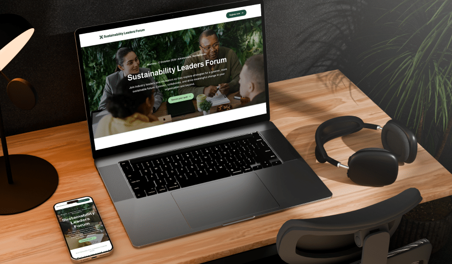
When it comes to event marketing tools, nothing is more important than your event website. As the digital “home” of your event, it acts as the single source of truth for everyone involved. It also needs to provide your target audience with enough motivation to register. Finally, your website is a great opportunity to attract potential sponsors and create buzz in the lead-up to the event itself.
That puts a lot of pressure on you to get it right.
You see, an event website that is attractive, engaging, accessible, and responsive will be one of your greatest assets. However, there is also a lot of scope for event websites to go wrong — especially if you’re not a professional web designer!
Thankfully, EventsAir is here to help. Without further ado, here are our 12 favourite tips for designing brilliant event websites:
- Start with clear goals
- Keep your content concise
- Leverage high-converting templates
- Prioritize a mobile-first experience
- Focus on brand consistency
- Make your calls-to-action clear
- Use strong visuals
- Design with accessibility in mind
- Test internally before going live
- Make your site multi-language ready
- Use password protection and coming soon pages
- Choose the right event technology partner
Tip #1 – Start with clear goals
Before you dive into layouts, colors, or copy, take a step back and ask: what does success look like for this event website?
Are you trying to drive early registrations? Build brand awareness? Promote a complex agenda or high-profile speakers? Perhaps you’d like to highlight your sponsors and exhibitors. Whatever your goals, they should shape every design and content decision from the start.
Clear goals also help you evaluate what content to include and what to leave out. By focusing your messaging around key outcomes, you’ll build a site that’s both purposeful and easy to navigate.
A great website isn’t just beautiful. It’s intentional, strategic, and aligned to what your event needs most.
Tip #2 – Keep your content concise
Your event website needs to communicate a lot, but that doesn’t mean it should say everything at once.
Attendees typically scan before they read, so it’s important to keep copy short, sharp, and well structured. Use clear headlines, short paragraphs, and bullet points to guide attention. Break up content into digestible sections so users can quickly find what they’re looking for.
Resist the urge to overload every page with detail. Focus on the essentials: who, what, when, where, and how to register. If you need to provide deeper information – like travel guides or detailed speaker bios – consider linking to separate pages or downloadable resources.
Clean, concise content not only looks better, it works better, too.
Tip #3 – Leverage high-converting templates
You don’t need to start from scratch to create a standout website.
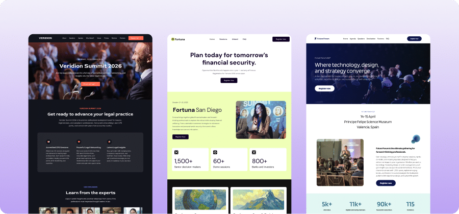
Templates are one of the fastest ways to build polished, professional pages, especially when they’ve been purpose-built for events. With EventsAir, you can choose from a growing library of high-converting templates designed to showcase agendas, speakers, sponsors, and more.
Each layout is fully customizable, so you can adjust structure, swap in your content, and apply your branding with ease. You can also mix and match pre-built content blocks to expand on a layout or create something new.
Templates give you a head start, saving time while ensuring your event site looks modern, clean, and conversion-ready from day one.
Tip #4 – Prioritize a mobile-first experience
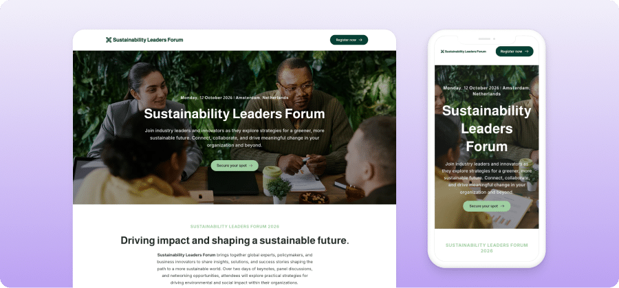
Today’s attendees are more likely to view your event website on their phone than on a desktop, especially in the early stages of discovery and registration.
That means your site needs to look great and function seamlessly across all screen sizes. Mobile-friendly layouts, readable font sizes, fast load times, and easy-to-tap buttons are essential.
The good news? EventsAir’s Website Builder includes responsive design by default, along with real-time device previews. That means you can build and fine-tune your site for desktop, tablet, and mobile all in one place; without needing to know a single line of code.
Better mobile experiences lead to better engagement and more conversions.
Tip #5 – Focus on brand consistency
Your event website should look and feel like an extension of your brand rather than a disconnected, one-off experience.
Each event has its own brand and identity, and your event website should be a clear reflection of that. With that in mind, always design your event website to be aligned with the style guide of your event (or the brand that is hosting it).
Start with your visual identity: apply your event logo, brand colors, and fonts consistently throughout the site. Use visual elements – like banners, icons, and buttons – that reflect your event’s personality and purpose. Consistency in these details builds trust and reinforces recognition. It will also help create a consistent and cohesive experience when repeated across the event life cycle.
In EventsAir, global design controls make this easy. You can set your fonts, colors, and styling elements once, and apply them easily.
When your website reflects your brand clearly and confidently, it communicates professionalism and creates a lasting impression.
Tip #6 – Make your calls-to-action clear
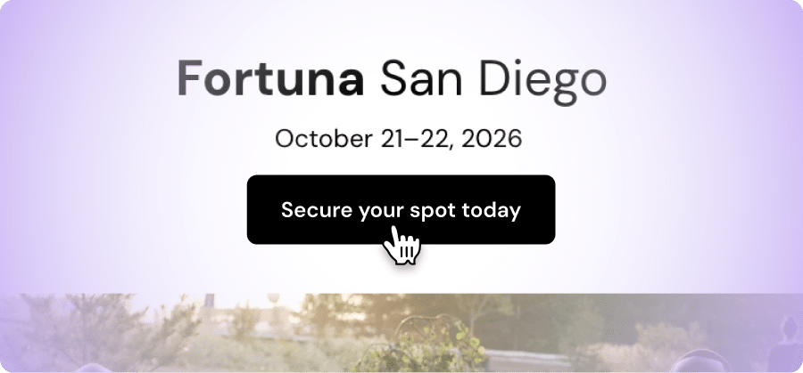
A beautiful website is only valuable if it drives action. And that starts with clear, compelling calls-to-action (CTAs).
Whether you want visitors to register, view the agenda, or download a brochure, make those actions obvious and easy to complete. Use bold buttons, action-oriented language, and strategic placement – like at the top of the page or directly after key content.
But… Please avoid cluttering your site with too many CTAs. Instead, focus on one primary goal per page and support it visually. Color contrast and spacing can help your CTAs stand out without overwhelming the design.
Depending on where you are in the event lifecycle, your CTAs might include:
- “Save the date” during early promotion
- “Register now” once tickets are live
- “Join the waitlist” if your event sells out
In EventsAir, it’s easy to add and style CTA buttons that align with your site’s overall look and even easier to copy the exact asset throughout your site to maintain that brand consistency we mentioned earlier.
Tip #7 – Use strong visuals
A great image or video isn’t just decorative; it helps tell your event’s story, build anticipation, and create emotional connection.
Choose visuals that reflect your audience and the tone of your event. This might include speaker headshots, venue photography, past event highlights, or sneak peeks at what’s to come. But remember: every image should serve a purpose. If it doesn’t enhance the user experience or support your message, it’s probably not needed.
Image file size also matters. If they’re too large, they won’t load quickly enough; if they’re too small, they will look blurry and unprofessional. Aim for a maximum of 1MB for large images and 300KB for smaller images. It’s always best to start with a high-quality picture and resize it, rather than try to make a low-quality image fit a larger space.
You can also optimize images further so they load quickly and look crisp on all devices (Hint: PNGs are the preferred image format, use a compressor like TinyPNG to optimize).
Finally, if you’re layering text across an image, always make sure the text is high-contrast so it’s readable against the image.
In EventsAir, you can showcase visuals using image galleries, hover effects, embedded video, and full-width banners. Honestly, the flexibility is endless… which means you can get very (very) creative.
Tip #8 – Design with accessibility in mind
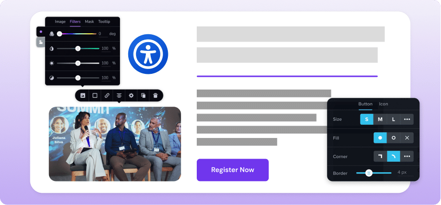
Every attendee deserves an event website they can easily navigate, understand, and engage with.
Accessible design is built into EventsAir’s Website Builder, with features like semantic HTML, support for keyboard navigation, adjustable tab indexing, ARIA labels, and an optional accessibility widget you can switch on with a click.
But accessibility isn’t a one-time setting. As a planner, you can enhance usability further by following a few key best practices:
- Add descriptive alt text for all images
- Use clear, consistent heading structures (H1 → H2 → H3)
- Ensure sufficient color contrast between text and background (Hint: Utilize a color contrast checker for your color palette)
- Avoid using color alone to convey meaning
- Provide clear labels for all form fields
- Use headings and spacing to group related content
- Use descriptive link text (e.g., “Register Now” instead of “Click Here”).
- Test all pages with keyboard navigation
- Provide captions/transcripts for audio and video content
- Ensure that interactive elements are easy to identify
With a little extra care, your website can be more inclusive for every visitor.
Tip #9 – Test internally before going live
Even the most perfect event website needs a final round of checks before launch.
Testing internally helps you catch broken links, fix typos, and make sure your site works across different devices and browsers. It also gives internal stakeholders – like marketing, sponsorship, or executive teams – a chance to review content and provide feedback before the public sees it.
With EventsAir’s Website Builder, you can preview your full site as you build it, and even password-protect it for limited access. This gives you total control over what’s live and what’s still in progress.
A short internal review process can save you from avoidable mistakes and ensure your site is polished, functional, and ready for attendees.
Tip #10 – Make your site multi-language ready
When your audience spans multiple regions or languages, clear communication is key. Multi-language support helps ensure that every visitor can access your content, understand key information, and feel included in the event experience.
EventsAir’s Website Builder makes it easy to support global attendees by allowing you to add and manage multiple languages within the same workspace. You can manually input translations, or connect a Google Translate API key for automatic content translation at scale.
Tip #11 – Use password protection and coming soon pages
Not every page needs to go live at once, and some might be better kept under wraps.
With EventsAir’s Website Builder, you can password-protect individual pages or entire sites to keep in-progress content hidden until you’re ready. This is ideal when you’re preparing a major agenda drop, building out sponsor pages, or staging complex information behind-the-scenes. It ensures that early visitors don’t stumble onto half-finished content.
You can also set your main site to display a “coming soon” or “maintenance” page – perfect if your event isn’t public yet, but your site structure is already in place.
Some planners even use password protection as a marketing tool: offering VIPs early access to book accommodation, claim exclusive offers, or preview premium experiences before anyone else.
With full control over visibility, you can launch each part of your site on your own terms.
Tip #12 – Choose the right event technology partner
We’re not going to lie, designing a best-practice event website from scratch isn’t an easy job if you’re not a skilled designer (and who amongst us is?).
Thankfully, there are tools out there that can do it for you. The right platform should give you creative freedom, built-in flexibility, and full control over your content, without requiring a developer to make updates. But it should also integrate seamlessly with your event’s broader ecosystem: registration, agendas, speaker bios, session details, and beyond.
EventsAir’s Website Builder is designed specifically for event professionals. It includes drag-and-drop editing, responsive layouts, global branding tools, multi-language support, and accessibility features. All built into the same platform you use to manage your entire event.
When your website and event tech work together, you create a smoother experience for attendees – and a much easier job for yourself.
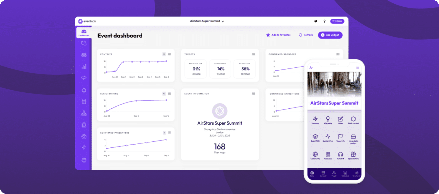
Ready to bring your event vision to life?
At EventsAir, we believe every great event starts with a strong digital foundation.
Our powerful drag-and-drop Website Builder helps you launch stunning, responsive, and accessible sites that bring your event to life online. But more than that, we give you the tools to manage your entire event lifecycle – from registrations and agendas to speakers, sponsors, mobile apps, and post-event reporting.
Whether you’re planning one event or one hundred, we’re here to help you market smarter, streamline operations, and deliver exceptional experiences, every step of the way.
Want to see it in action? Book a demo with the EventsAir team today.
Best Practice | Event Marketing | Event Technology & Apps
See EventsAir in action
Discover why 12,000+ event professionals trust EventsAir to deliver effortless events, every time.
